Chart creation
In BangDB we have the option to create charts for the dashboard from 2 sections: Stream & Graph. When we say chart creation, we are here referring to many visualization tools that allow us to create charts, cards, graphs, and many more, w.r.t. available Data. Now let's discuss both sections and see the steps and prerequisites we need to follow.
Using Stream Section
BanDB allows us to use all these visualization tools which are available in the Stream section.

But before creating charts we need to follow some prerequisites:
- Schema creation
- Data pushing
Schema creation
For schema creation we are here attaching a sample schema so that anyone can use it.
{
"notifs": [],
"schema": "Sales",
"streams": [
{
"name": "Data",
"inpt": [],
"swsz": 86400,
"type": 1,
"attr": [
{
"name": "Country",
"type": "STRING",
"kysz": 40,
"gran": 60,
"stat": "UCOUNT"
},
{
"name": "State",
"type": "STRING",
"kysz": 40,
"gran": 60,
"stat": "UCOUNT"
},
{
"name": "City",
"type": "STRING",
"kysz": 40,
"gran": 60,
"stat": "UCOUNT"
},
{
"name": "SalesAmount",
"type": "DOUBLE",
"gran": 60,
"stat": "RSTAT"
}
],
"catr": [],
"refr": [],
"join": [],
"fltr": [],
"cepq": [],
"gpby": [
{
"gpat": [
"Country"
],
"gran": 900,
"kysz": 64,
"swsz": 86400,
"iatr": "SalesAmount",
"stat": "RSTAT"
},
{
"gpat": [
"State"
],
"gran": 900,
"kysz": 64,
"swsz": 86400,
"iatr": "SalesAmount",
"stat": "RSTAT"
},
{
"gpat": [
"City"
],
"gran": 900,
"kysz": 64,
"swsz": 86400,
"iatr": "SalesAmount",
"stat": "RSTAT"
},
{
"gpat": [
"State",
"City",
"Country"
],
"gran": 900,
"kysz": 64,
"swsz": 86400,
"iatr": "SalesAmount",
"stat": "RSTAT"
}
],
"enty": []
}
],
"udfs": []
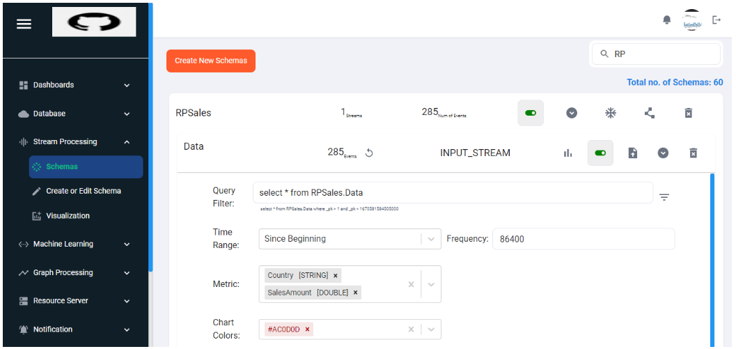
}Copy the attached schema and save it as .json format in your system.
Click on Create or Edit schema under the Stream Processing section.
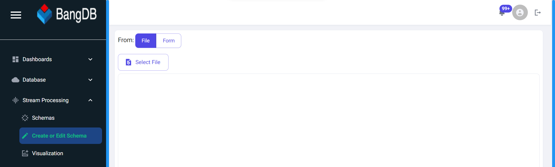
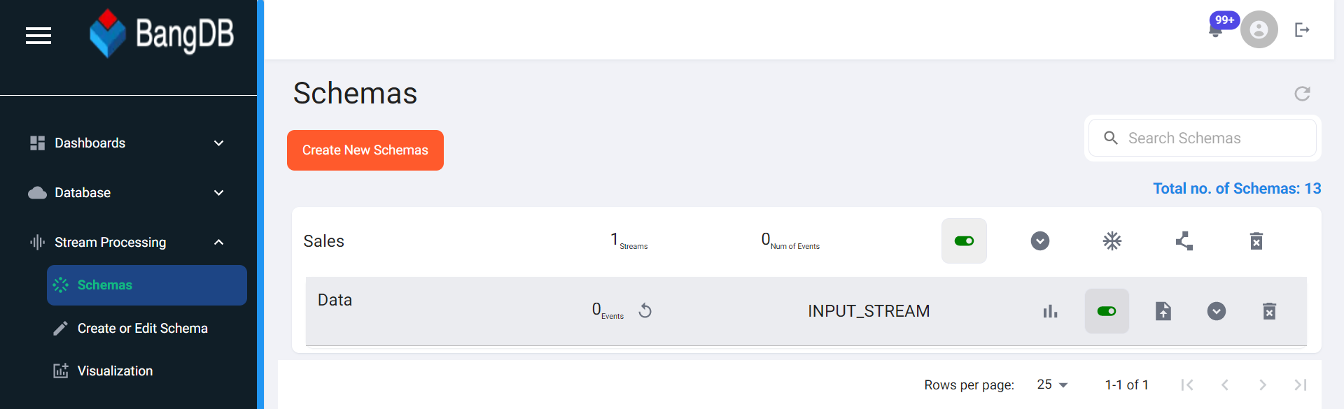
Click on File -> Select File and pick your .json schema file. And click on the upload button in the bottom of the page. Now the schema has been uploaded successfully. You can check your schema in the Schema section and search the name Sales. 'Data' is our Stream name.
Data pushing
The schema part is now done. Now we have to push the data. BangDB allows us to push the data into streams in many ways, this time we will push data by uploading the data file.
We are here attaching one dataset, you can download this dataset and follow below steps to push this data OR you are free to use any other dataset too.
Dataset Link: https://drive.google.com/file/d/1AcfvB8200A3ReKRWPWNQNv4-v-HwwFy2/view?usp=share_link
After searching for the schema in schema section, if you click on the streams, here you will be able to see your available streams as you defined in the schema. On the right side, you will get an option to upload the file.
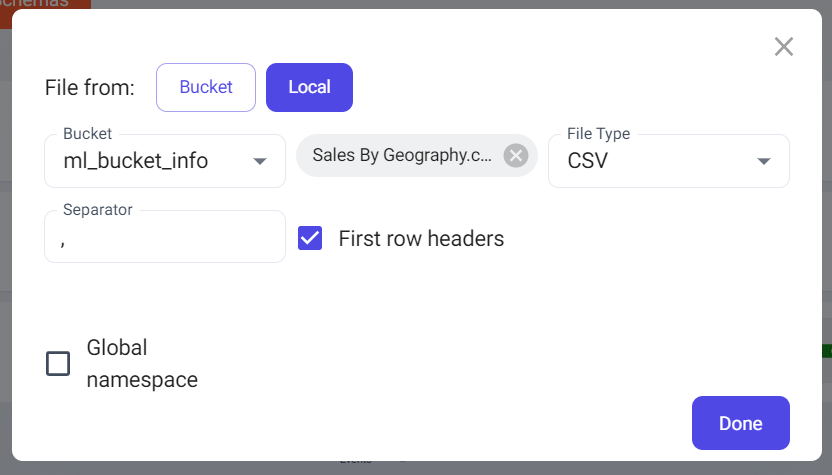
If you click on the upload button, one pop-up will come up.
Select Local->Select File->File type as CSV
Select any bucket from the dropdown in the bucket section and Keep everything as default and click on Done.
Now data pushing is done and it will be reflected automatically as 285 records have been added. Now all the prerequisites are done, now we can create charts and make an appropriate dashboard.
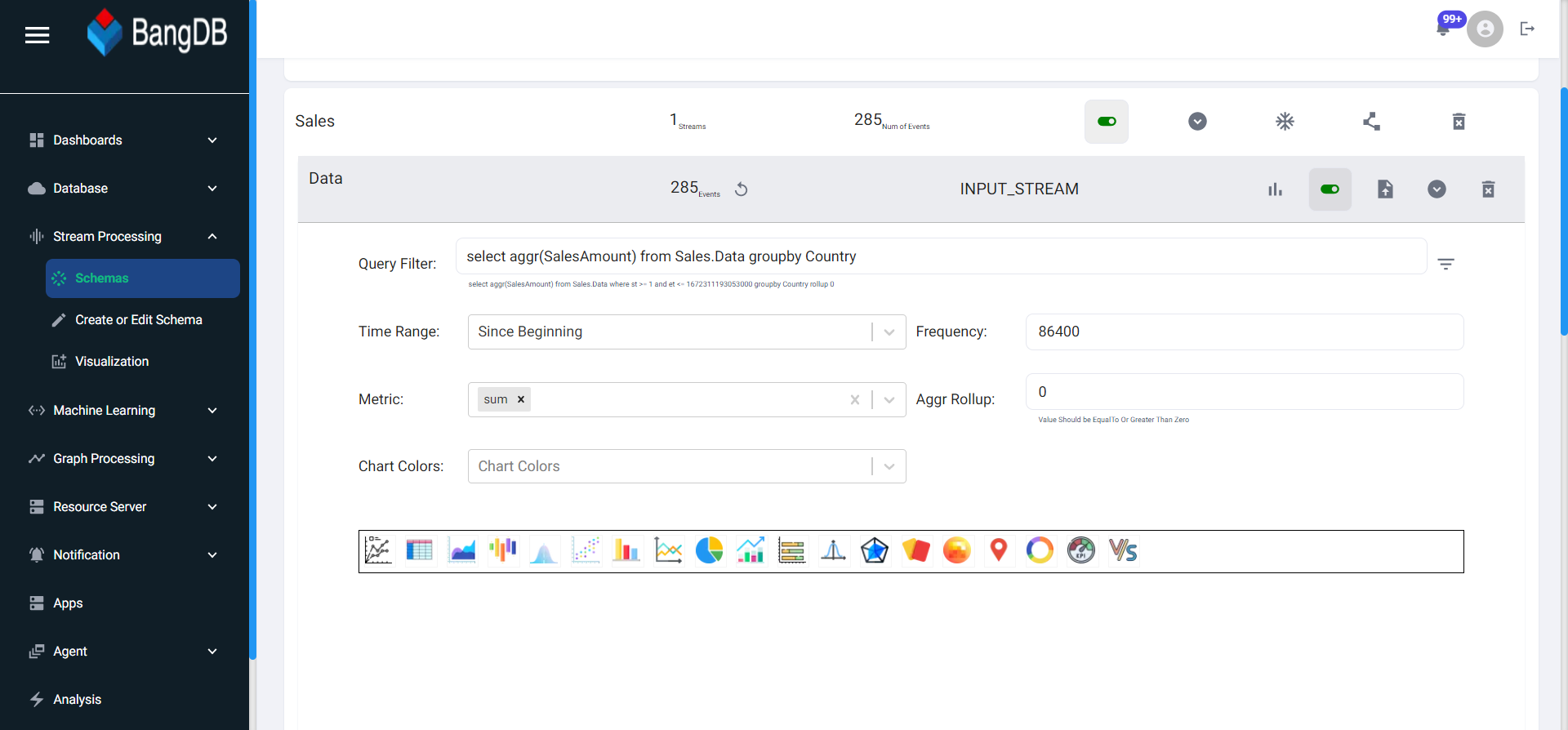
Chart creation
Click on the visualization button under the stream section.
- Query Filter
- Time Range
- Frequency
- Metric
- Chart Colors
Here you can see the Query filter tab, if you click on the empty tab, BangDB will suggest the possible queries that we can use. Although you can write your own query too in the tab.
We can show the data of past x-Minutes, x-Hours, x-Days, x-Weeks, x-Months. BangDB also gives us the liberty to show Full data or custom date ranges we can also use.
How frequently we want our data to be updated for the chart. We can set frequency in seconds. Here 86400 is our seconds which actually means 1 Day.
BangDB gives us the feature to use all these matrices: count, sum, min, max, avg, skew, stddev, and kurtosis.
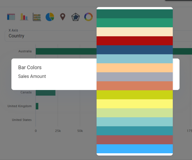
We can select colors for our bars and charts.
Here are some possible charts we can create for our dashboard.
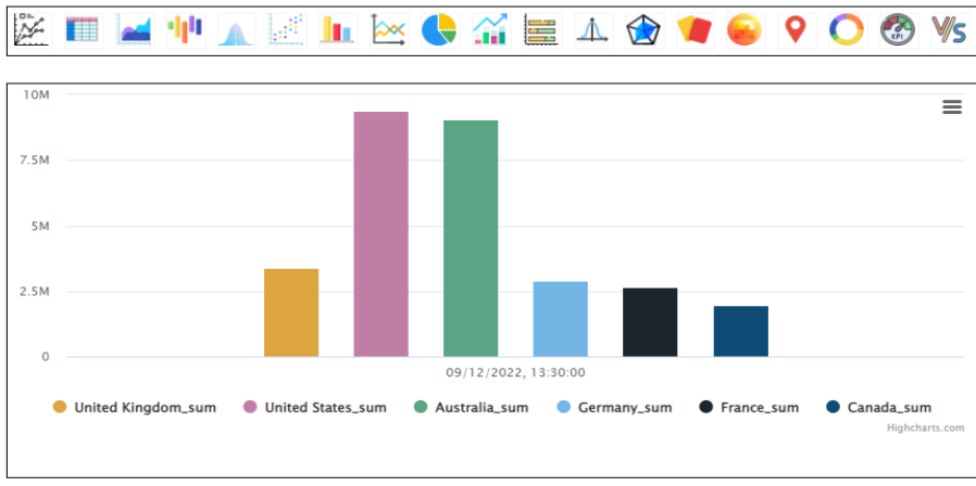
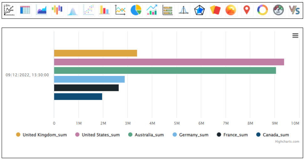
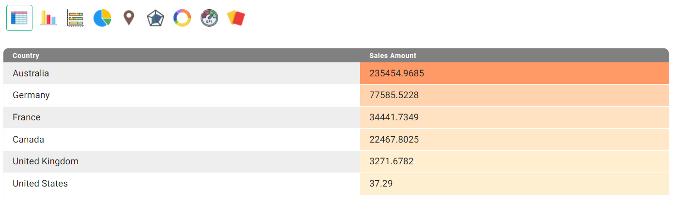
Sales by Country
Candle graph
We are here showing a candle graph which shows the Total Sum of Sales, specific to Countries.
If you scroll down, you will see the options to set Y-axis n2ame, Chart Name, Dashboard Name, and Dashboard Description
You can either select an already created dashboard or you can create a new one and click on Save chart.
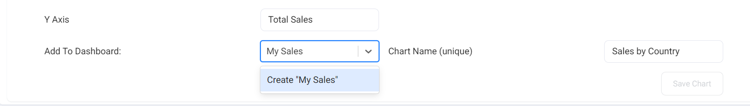
Now our chart is saved in our newly created dashboard: My Sales.
In a similar way you can select any other charts too and add them to the dashboard.
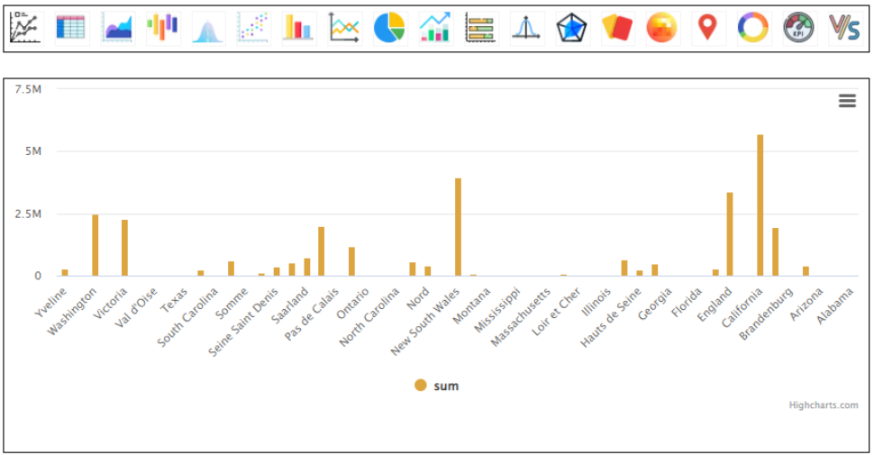
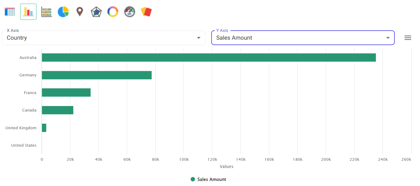
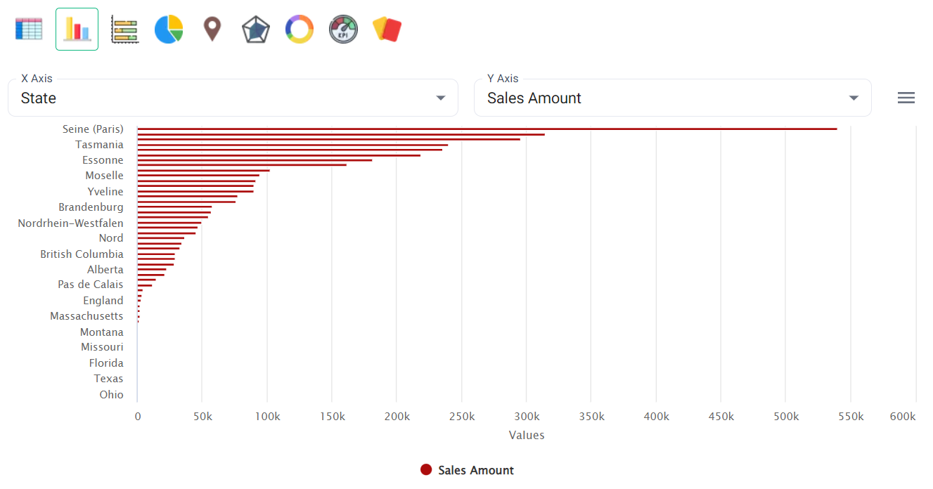
Bar graph
It presents categorical data(Country) with rectangular bars with heights or lengths proportional to the values(Sum of Sales) that they represent.
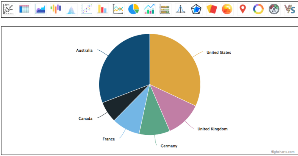
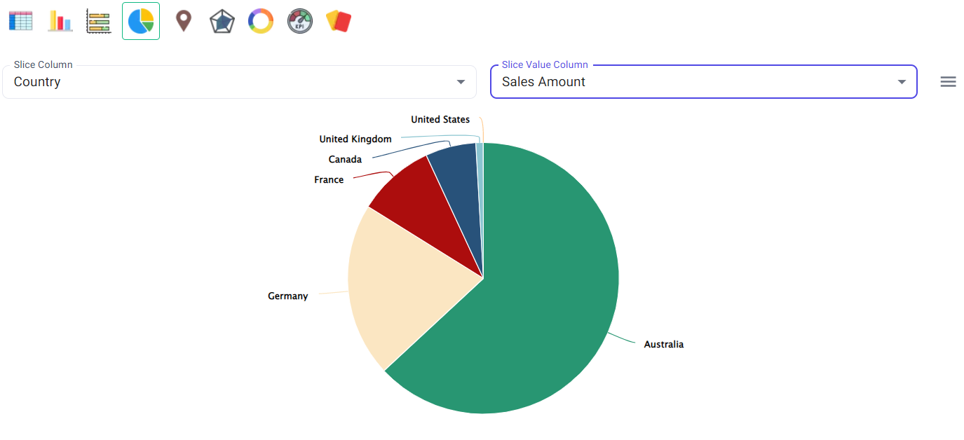
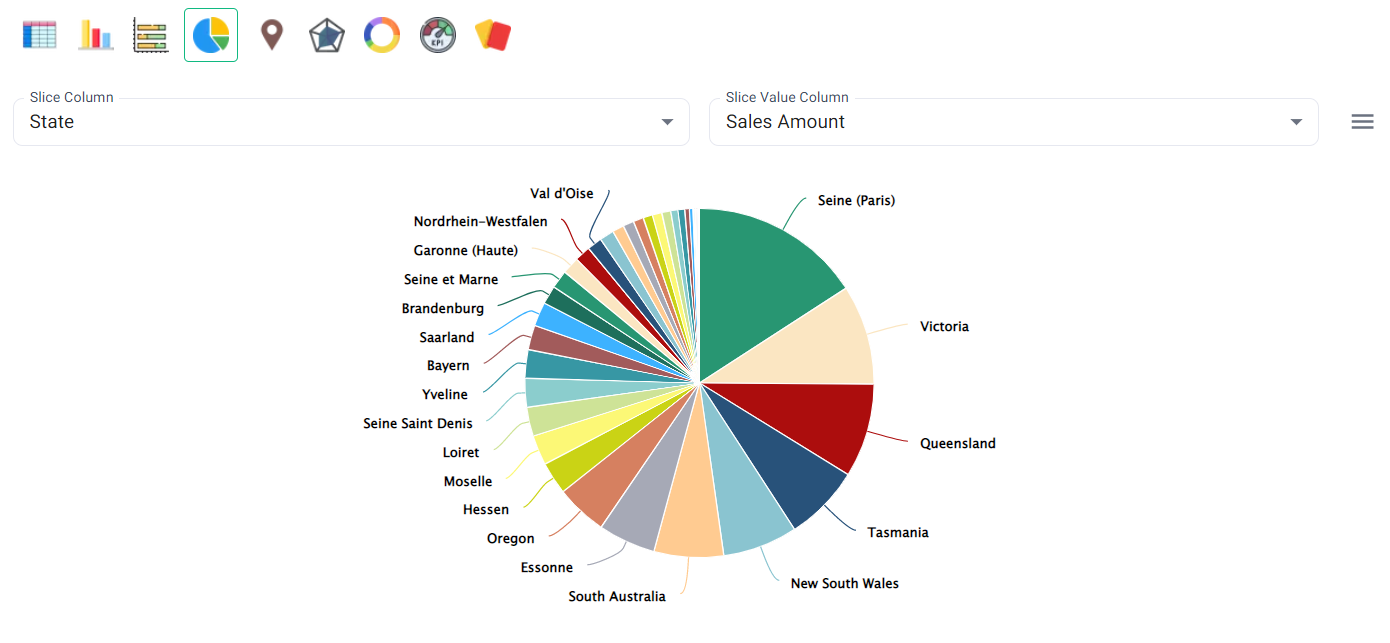
Pie chart
It divided countries into circular statistical slices to illustrate the sum of sales proportion.
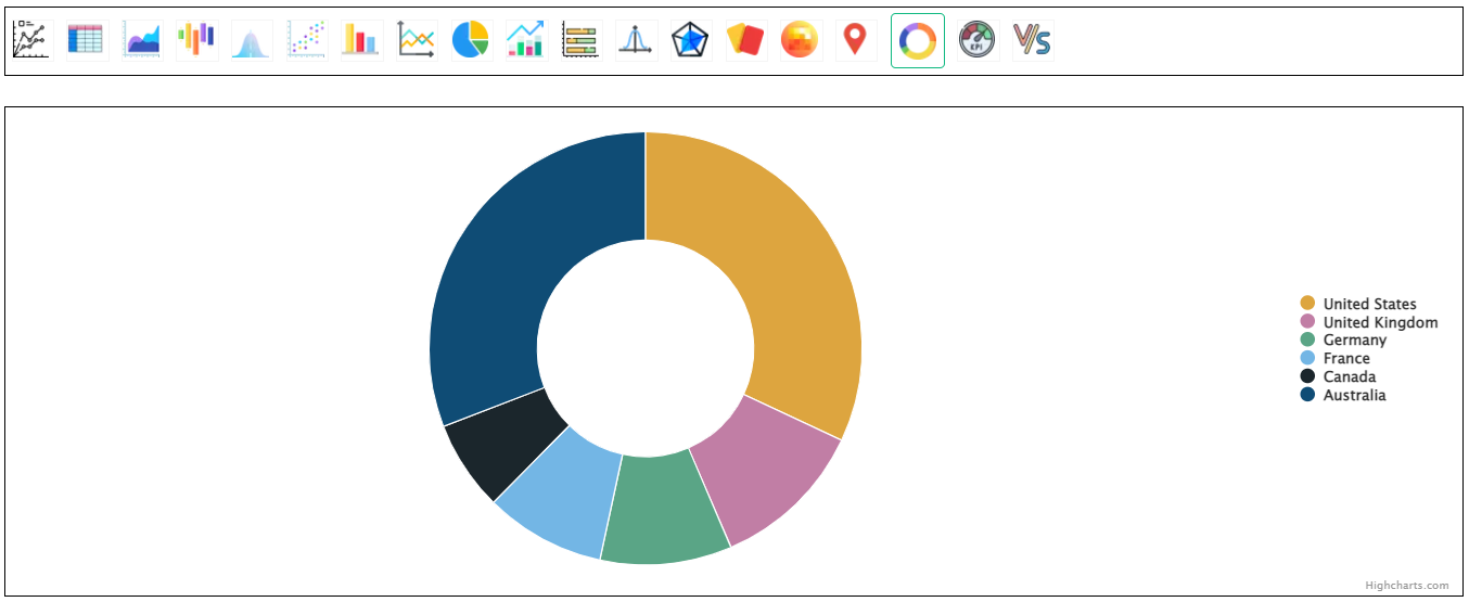
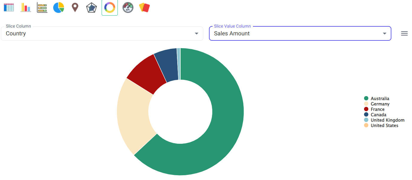
Donut chart
It divided countries into slices to illustrate the sum of sales proportion.
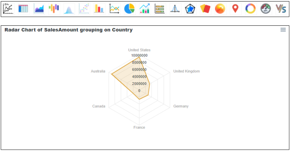
Radar chart
It shows data as a 2-Dimensional graph.
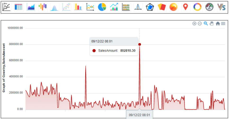
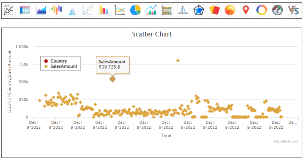
Area graph
If our data has a DATE column then we can use some other types of graph too. To do that, please use the configurations mentioned in the image. If DATE is not available in the data, we can use the date which is added by BangDB itself based on when we pushed the data into the stream.
- You can refer below configurations to use Area and scatter graph.
- Area and scatter graphs are mainly helpful in time-series analysis.
- Here it is showing how Sales data is changing every day for all the countries.
Scatter chart
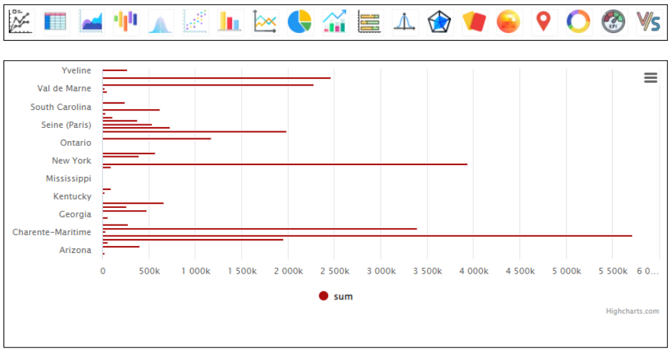
Sales by State
Candle graph
Bar graph
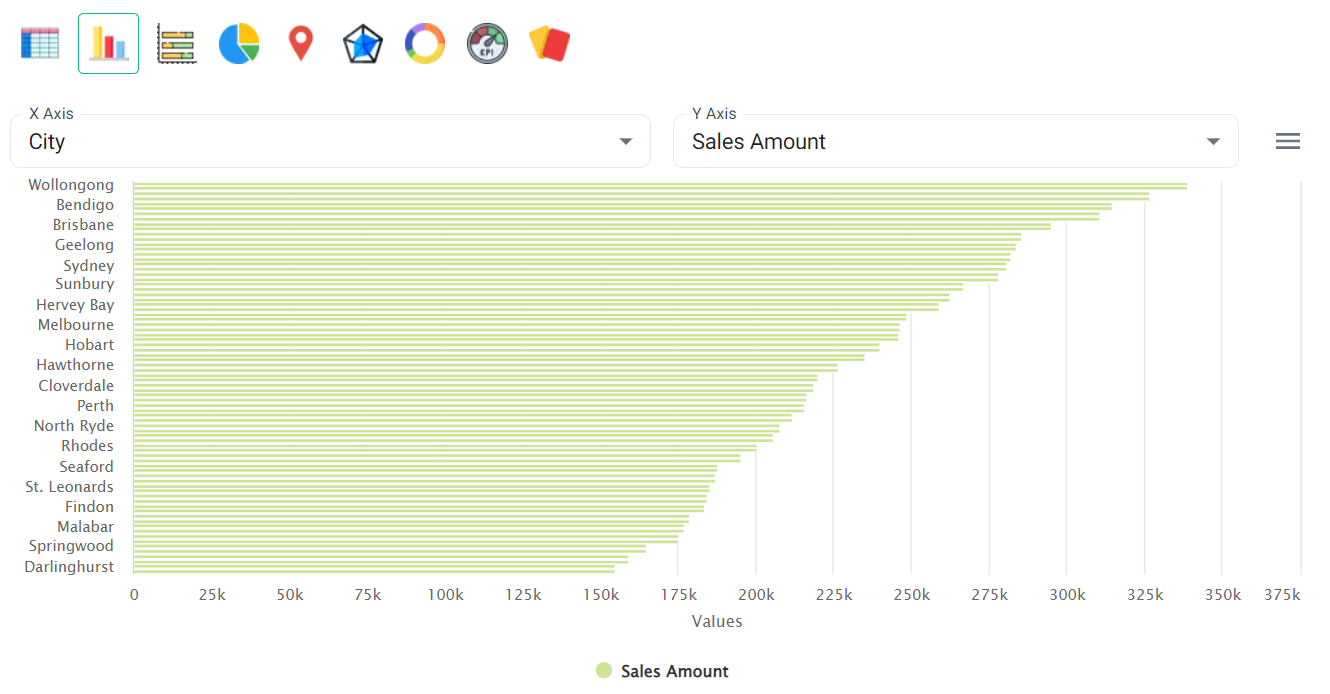
Sales by City
Candle graph
In a similar way we can use other suggested queries also. After saving all the charts, you can go to the dashboard and rearrange them as per the requirement.
Using Graph section
BanDB allows us to use all these visualization tools which are available in the Graph section.
But before creating charts we need to follow some prerequisites:
- Schema creation
- Data pushing
Schema creation:
The schema that we used earlier for Stream will not be useful as no Nodes and no Relationships were formed. We are here attaching a new schema that anyone can use to run cypher queries and create charts accordingly.
{
  "notifs": [],
  "schema": "Sales",
  "streams": [
    {
      "name": "Data",
      "inpt": [],
      "swsz": 86400,
      "type": 1,
      "attr": [
        {
          "name": "Country",
          "type": "STRING",
          "kysz": 40,
          "gran": 60,
          "stat": "UCOUNT"
        },
        {
          "name": "State",
          "type": "STRING",
          "kysz": 40,
          "gran": 60,
          "stat": "UCOUNT"
        },
        {
          "name": "City",
          "type": "STRING",
          "kysz": 40,
          "gran": 60,
          "stat": "UCOUNT"
        },
        {
          "name": "SalesAmount",
          "type": "DOUBLE",
          "gran": 60,
          "stat": "RSTAT"
        }
      ],
      "catr": [],
      "refr": [],
      "join": [],
      "fltr": [],
      "cepq": [],
      "gpby": [
        {
          "gpat": [
            "Country"
          ],
          "gran": 900,
          "kysz": 64,
          "swsz": 86400,
          "iatr": "SalesAmount",
          "stat": "RSTAT"
        },
        {
          "gpat": [
            "State"
          ],
          "gran": 900,
          "kysz": 64,
          "swsz": 86400,
          "iatr": "SalesAmount",
          "stat": "RSTAT"
        },
        {
          "gpat": [
            "City"
          ],
          "gran": 900,
          "kysz": 64,
          "swsz": 86400,
          "iatr": "SalesAmount",
          "stat": "RSTAT"
        },
        {
          "gpat": [
            "State",
            "City",
            "Country"
          ],
          "gran": 900,
          "kysz": 64,
          "swsz": 86400,
          "iatr": "SalesAmount",
          "stat": "RSTAT"
        }
      ],
      "enty": [],
      "node": [
        {
          "sub": "Country",
          "label": "Country",
          "props": [
            "SalesAmount"
          ],
          "updt": 0
        },
        {
          "sub": "State",
          "label": "State",
          "props": [
            "SalesAmount"
          ],
          "updt": 0
        },
        {
          "sub": "City",
          "label": "City",
          "props": [
            "SalesAmount"
          ],
          "updt": 0
        }
      ],
      "rels": [
        {
          "sub": "Country",
          "sub_label": "Country",
          "obj": "State",
          "obj_label": "State",
          "rel": "HAS",
          "sub_props": [
            "SalesAmount"
          ],
          "obj_props": [
            "SalesAmount"
          ],
          "rel_props": []
        },
        {
          "sub": "State",
          "sub_label": "State",
          "obj": "City",
          "obj_label": "City",
          "rel": "HAS",
          "sub_props": [
            "SalesAmount"
          ],
          "obj_props": [
            "SalesAmount"
          ],
          "rel_props": []
        },
        {
          "sub": "Country",
          "sub_label": "Country",
          "obj": "City",
          "obj_label": "City",
          "rel": "HAS",
          "sub_props": [
            "SalesAmount"
          ],
          "obj_props": [
            "SalesAmount"
          ],
          "rel_props": []
        }
      ]
    }
  ],
  "udfs": []
}
You can use this schema and register it in a similar manner as we discussed earlier.
Data pushing:
Push the data as we discussed in the earlier steps.
Chart creation
In the graph section, we have to write queries first to make appropriate charts. These are some of the possible queries we can use to make charts.
Country-specific Sales Details:
S=>(@P Country:*);RETURN P.name AS Country, P.SalesAmount AS "Sales Amount" SORT_DESC "Sales Amount"Table chart
Bar chart
You can select X-axis and Y-axis from the dropdown. If you click on the three-horizontal lines, you can even change the color of bars inside.
If you scroll down, you can give the chart name and dashboard name as we did in the stream section.
Pie chart
Donut chart
Min/Max cards
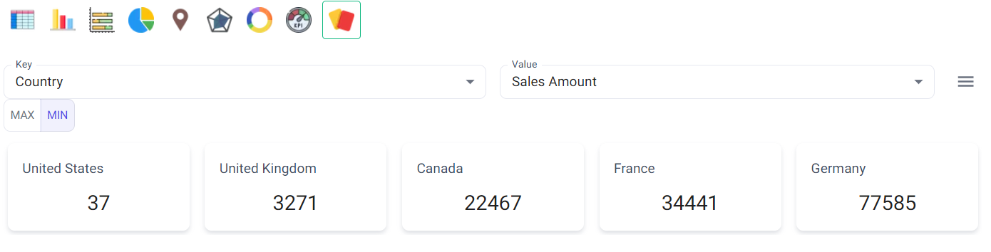
- In MAX card: It shows the Top-5 countries where Sale is Highest
- In MIN card: It shows the Top-5 countries where Sale is Lowest
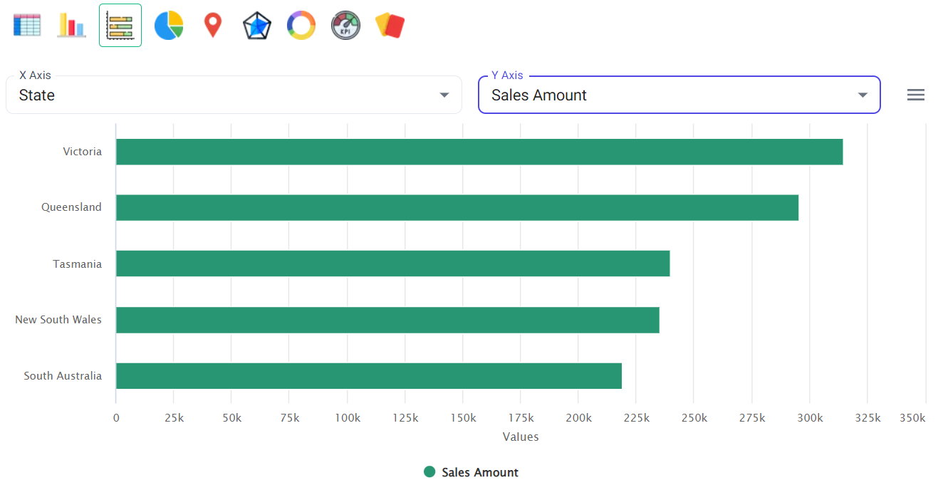
State-specific Sales Details
S=>(@P State:*);RETURN P.name AS State, P.SalesAmount AS "Sales Amount" SORT_DESC "Sales Amount"Pie Chart
Bar Chart
Sales details of all the Cities in a specific Country
S=>(@P State:*);RETURN P.name AS State, P.SalesAmount AS "Sales Amount" SORT_DESC "Sales Amount"Bar chart
Sales details of all the States in a specific Country
S{UNIQUE_IN_CONTEXT}=>(@C Country:{name = "##Country"})-[@ HAS]->(@P State:*);RETURN P.name AS State, P.SalesAmount AS "Sales Amount" SORT_DESC "Sales Amount"Stack-Bar Chart
In a similar way, we can make different queries and make charts as per the requirement.
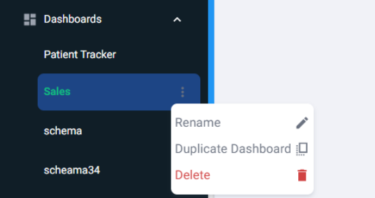
Dashboard Section
BangDB gives us the feature to:
- Rename the dashboard.
- It also has a feature to create copies of the dashboard.
By clicking on the 3 dots we can see all these options.
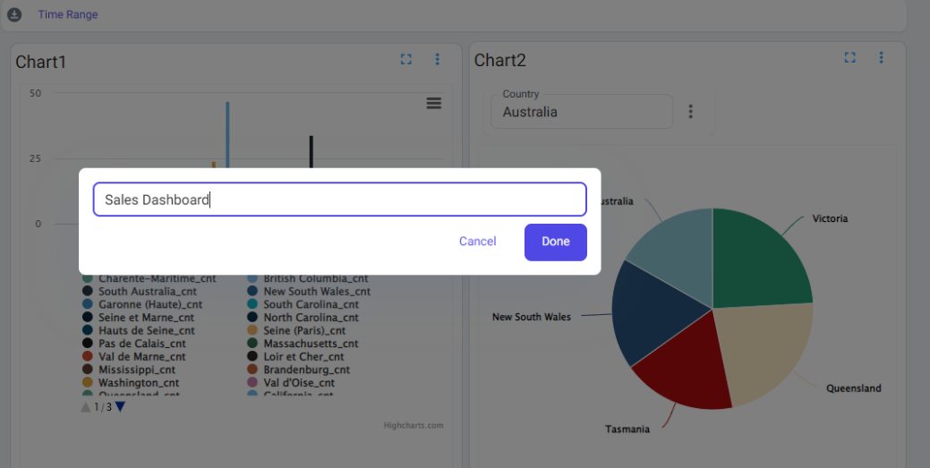
Rename the dashboard title
Click on the edit button on the top right side of the page.
Rename the chart
Click on the Chart name(e.g. Here chart name is 'Chart1') and you will be able to rename the chart name.
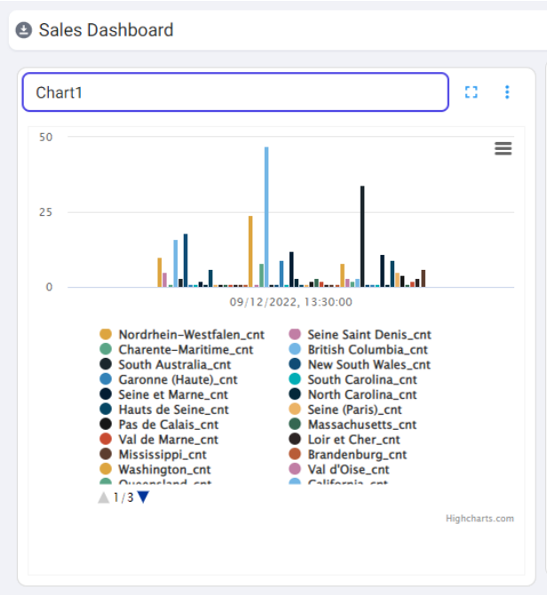
Chart Modifications and some more Information
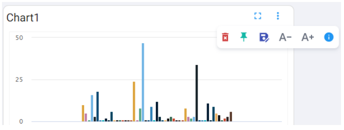
If you click on the 3 dots on the top right side of the chart, one pop-up will appear. You will get the option to:
- Delete the chart
- Pin the chart: If you want to move the chart, first we have to Unpin it. After moving, we have to Pin in again so that it won't change it's position if page reloads happen.
- Save the chart: if we move/resize the chart or change the query of the definition of the chart then it's important to save the changes.
- Increase/Decrease the font size of the Chart Title.
- More Information: Advance modifications
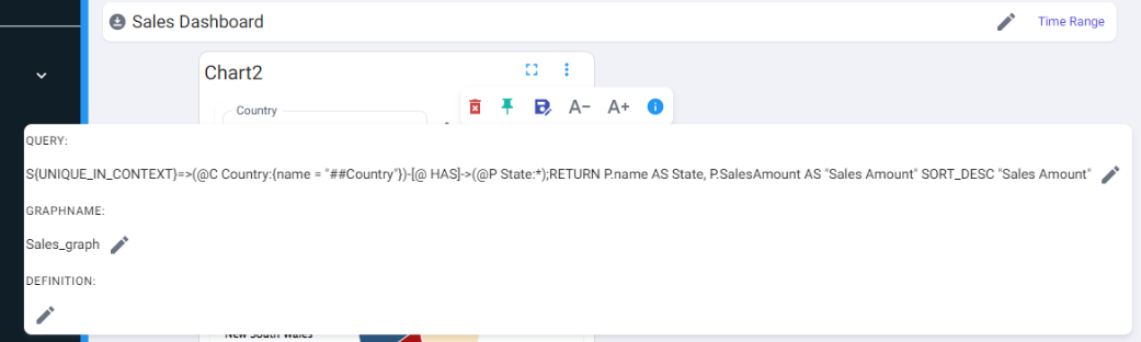
If you click on more information, You will get options to make advance changes like:
- Query update
- Graph Name update
- Definition update
You can make all the changes and see the result in real time.
Other features:
- BangDB allows us to see the chart in Full-screen mode.
- We can also download the chart in PNG format.
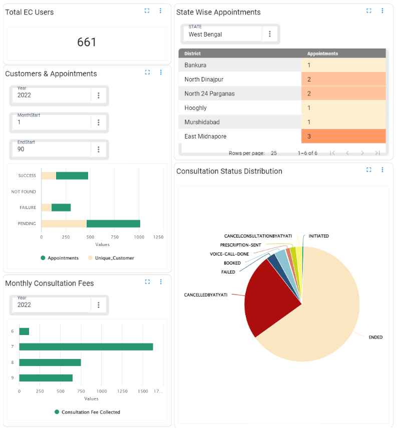
Final Dashboard Template: